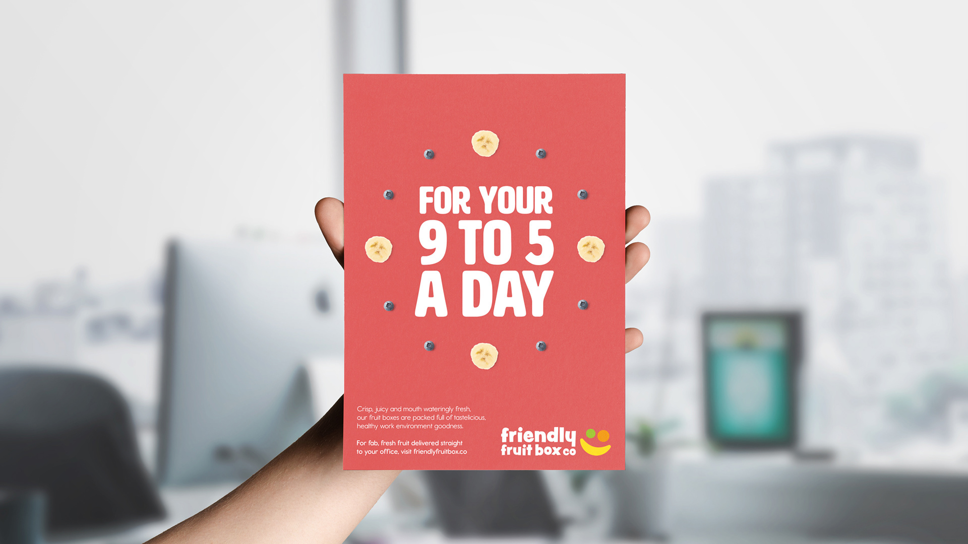
A fruit delivery brand that swaps worthy messaging for colour, character, and a big friendly smile.
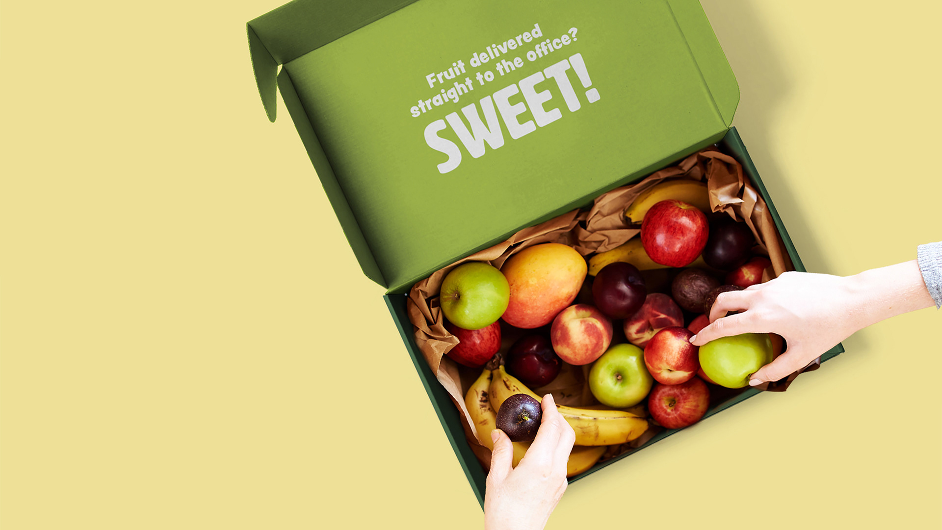
Friendly Fruit Box Co. is an office subscription service delivering fresh fruit on a regular basis. The key challenge was to make fruit feel playful and appealing, rather than routine or overtly “healthy.”
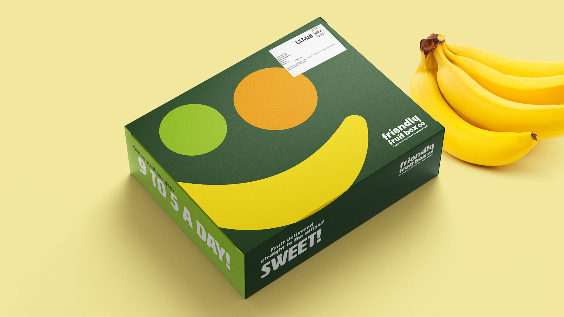
The identity leans into the Friendly Fruit name through an abstract smiley-face logo formed from simplified fruit shapes, creating a mark that feels approachable and full of character.
This friendly tone extends across the wider brand system, with bright colours, playful packaging, and humorous advertising. Together, these elements reposition fruit as something joyful and social — a small but positive moment in the working day.