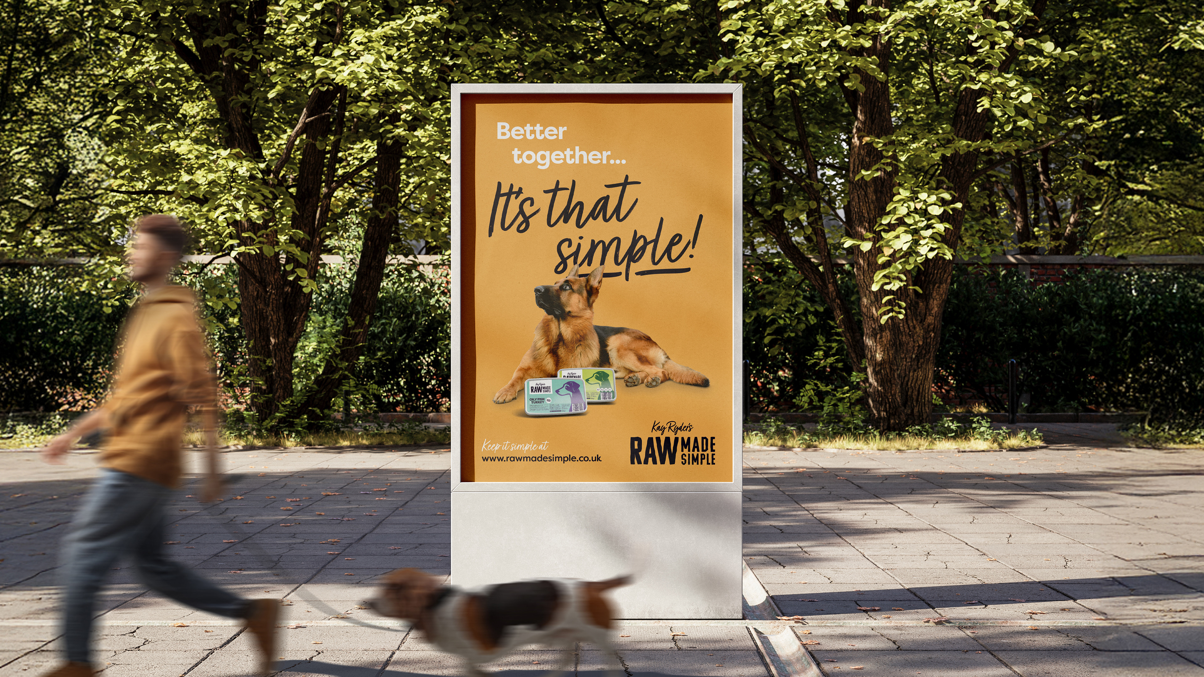
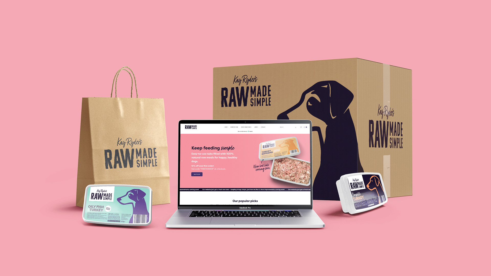
A stripped-back rebrand that puts simplicity back at the heart of the product.
Raw Made Simple required a brand refresh to support the next stage of growth. The existing identity had become busy and incoherent, drifting away from the brand’s core value: simplicity.
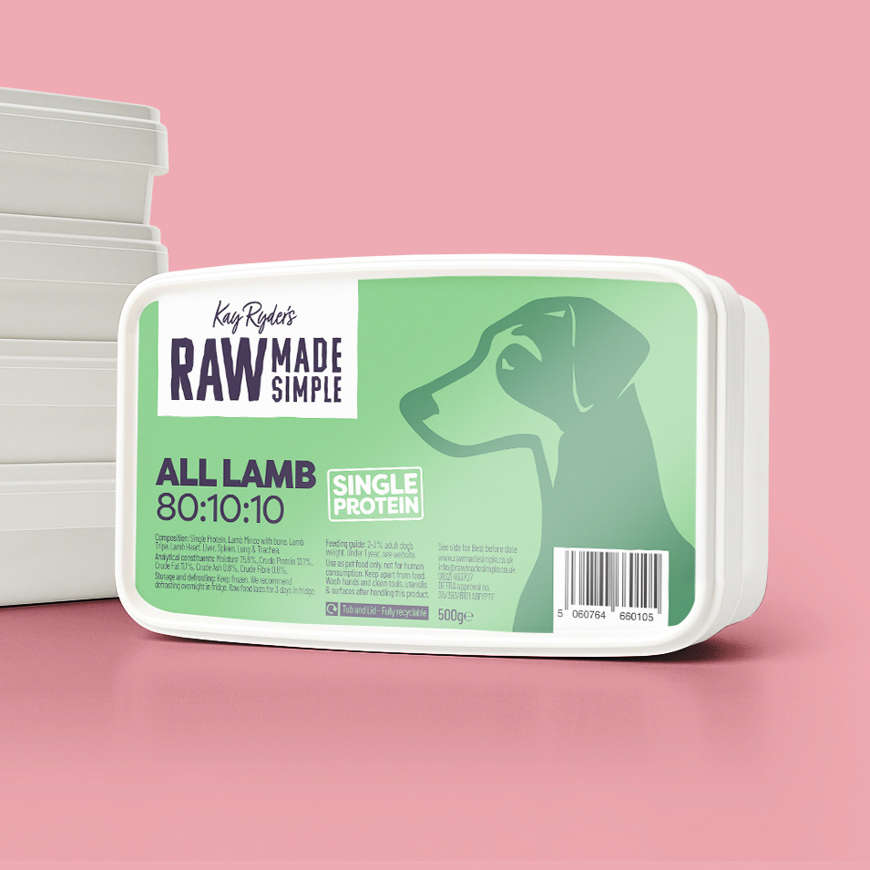
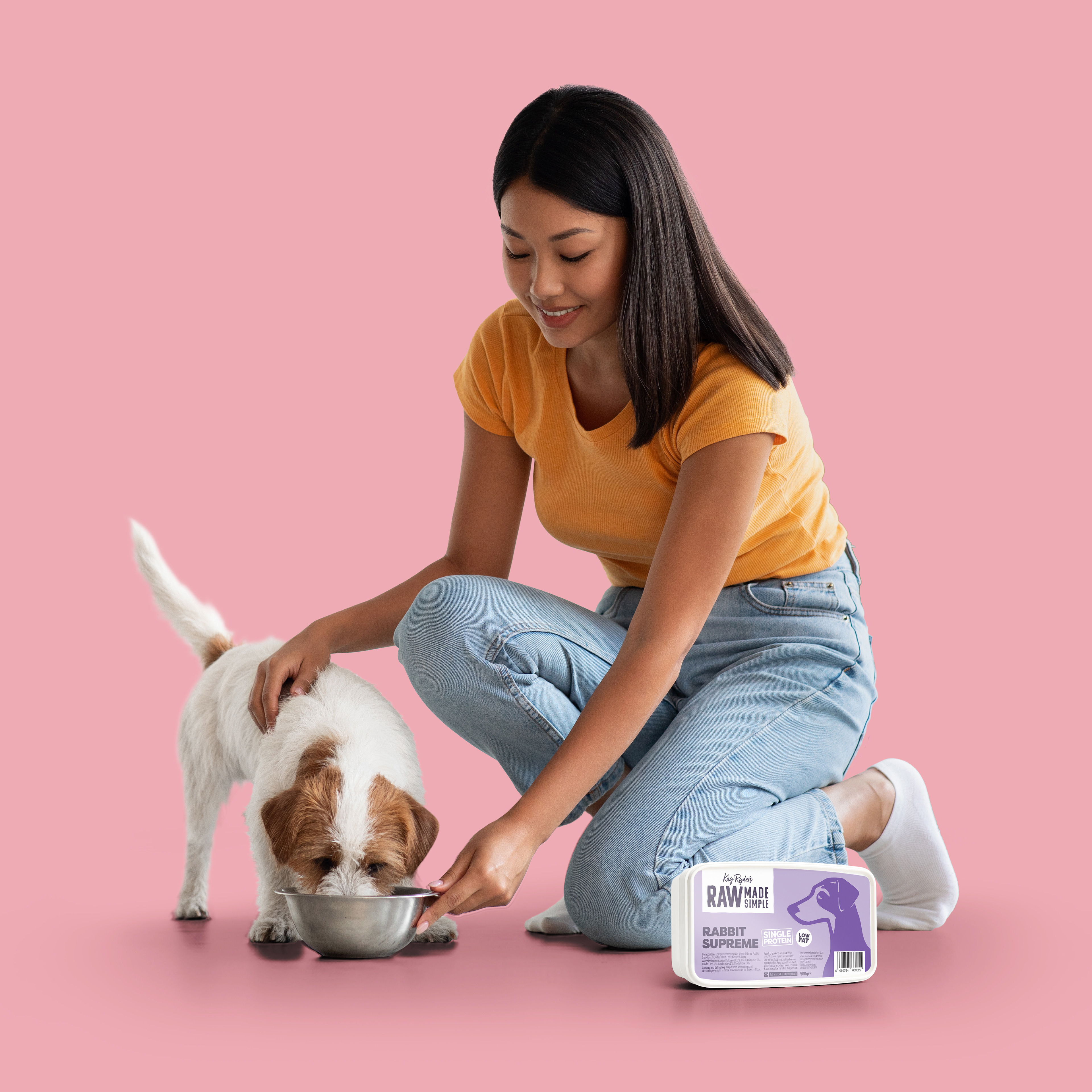
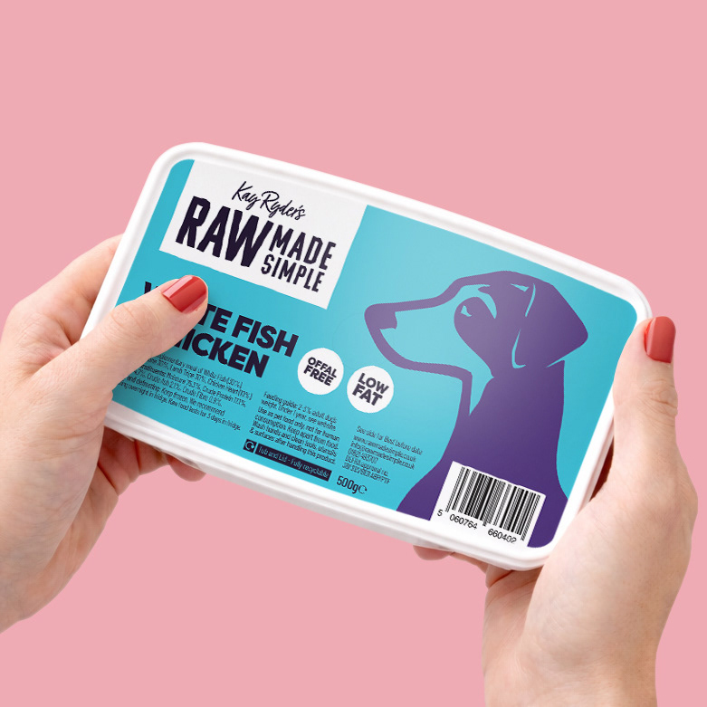
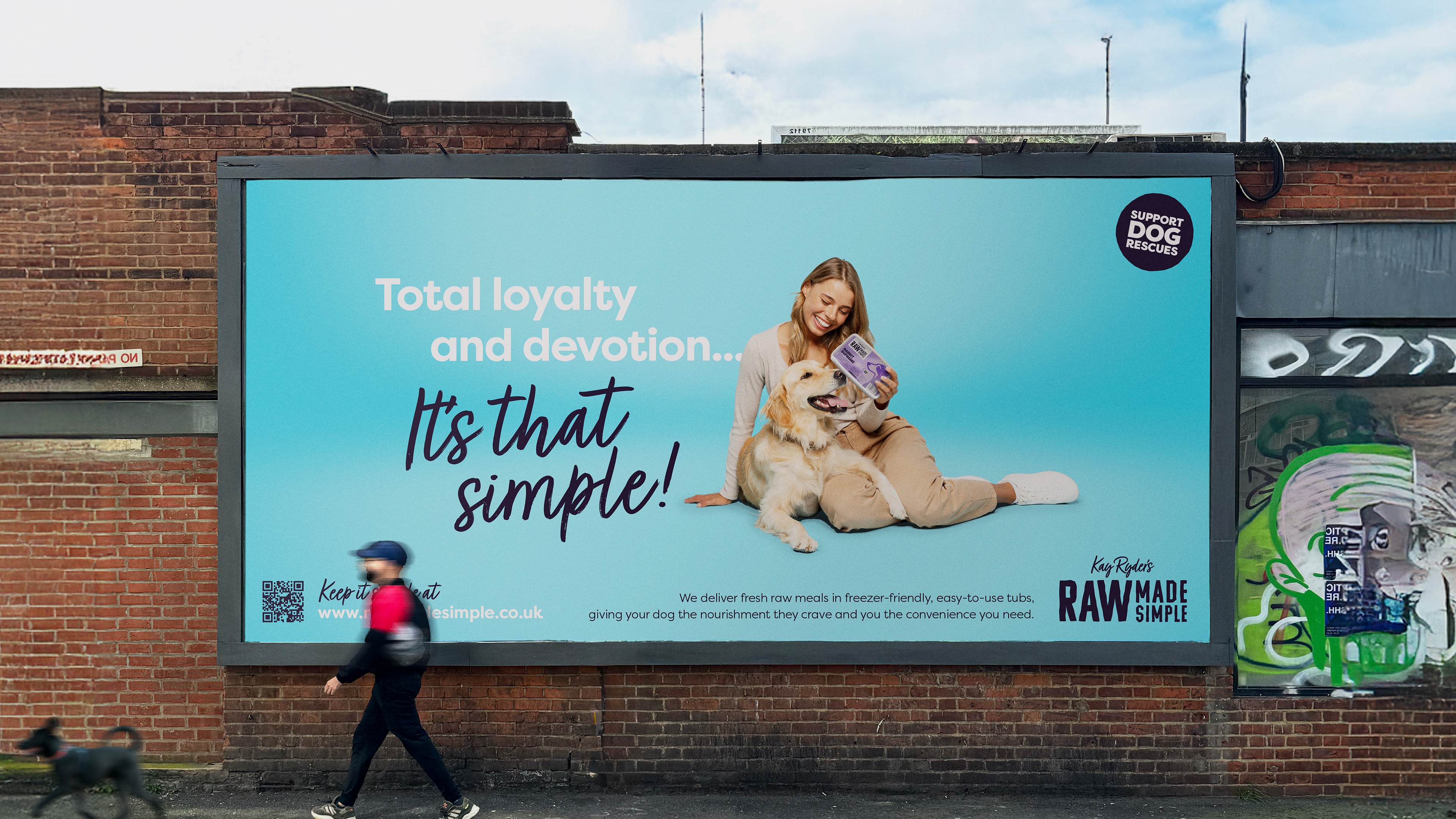
The new direction focused on clarity and restraint, using simple colours, clean typography, and stripped-back layouts. The identity also subtly reflects the personal touch of founder Kay Ryder, reinforcing trust and authenticity.
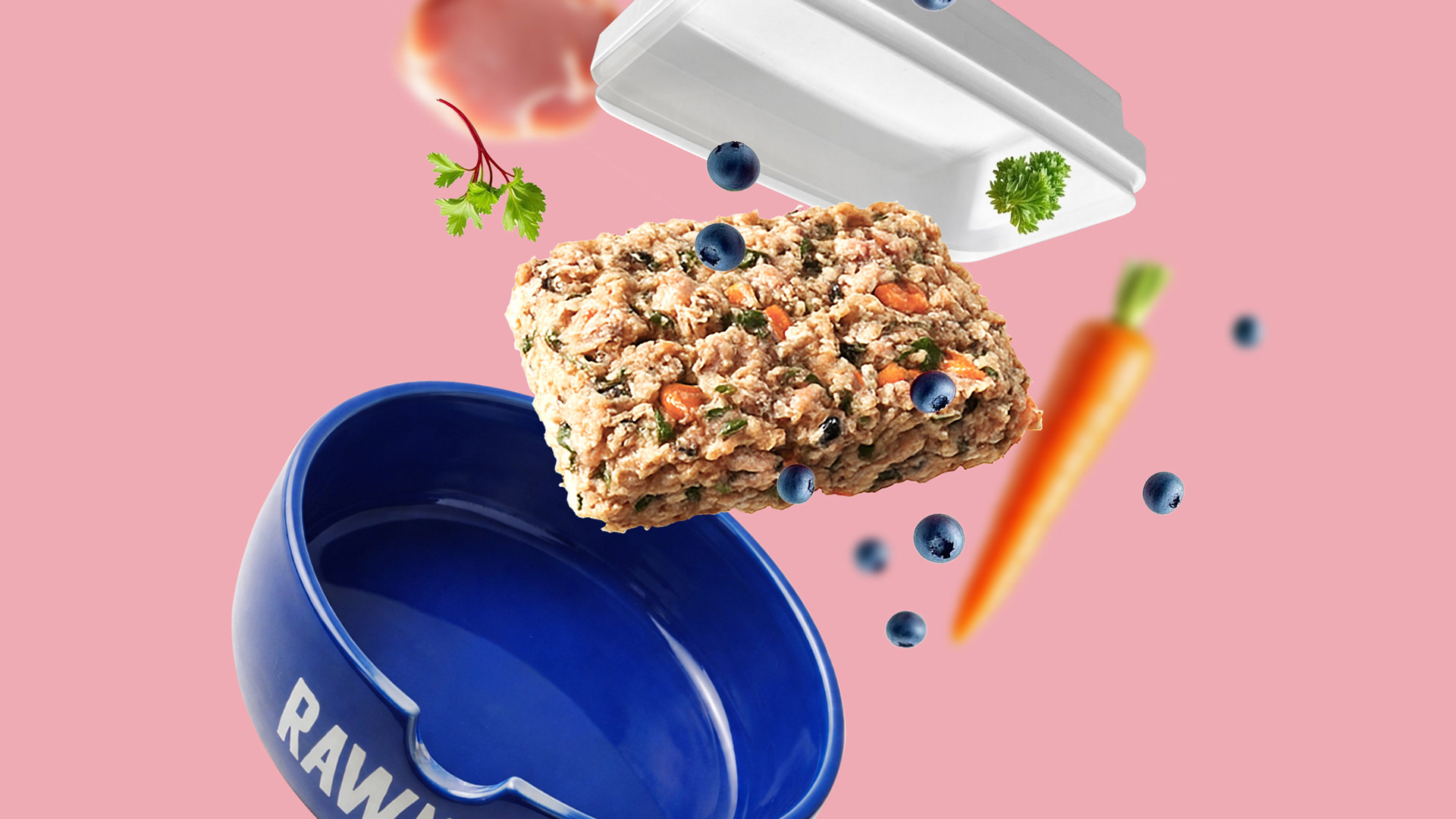
Across packaging and wider brand touchpoints, the refreshed look brings the brand back to its essence — straightforward, honest raw food, clearly communicated.